
Overview
|
Overview |
Marathon is an online collaborative platform for energy industry companies to manage their assets and monitor the performance in the field. It detects asset performance anomaly and prevents upcoming failure, achieving great cost saving.
Industry | B2B Data Analytics
Platform | Web browser, Tablet (ongoing)
Role | Design Lead, UX Research, QA
Date | 2020 - Present
Website | https://www.arundo.com/marathon
Impact

My design has helped both my company and our clients’ business. Some rough figures:
15,000 USD
The average amount our clients save from one successful equipment failure prevention.
12 Hours
The average amount of time our users save within a week from performing their daily tasks.
225%
The amount of increased time the users spend in the product since our first release.
900,000 USD
The average yearly raw revenue we earn from a client subscription.
From Zero to Hero

Looking back on what I did right, it’s a combination of field research + determined positioning + starting from a well-defined user story then generalizing across industries.
B2B product users are different from customers. I created systematic personas of these stakeholders, one for each industry. Then summarized a generic version for product guidance.
Web Journey and Ecosystem
Marathon consists of 4 parts: the main app, the notification, the user center and the admin center. I am responsible for the design of all these parts. This wraps up the overview. Now here is an example of my work of design for business strategy realization, and a summary of design system implementation.
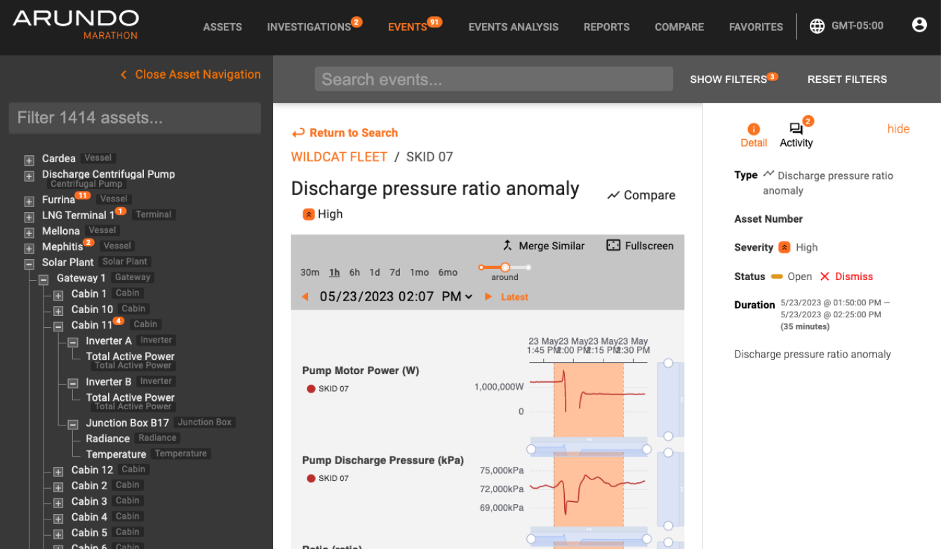
Below is a recap of the design work done on the new Asset KPI page in Marathon.

Design for Business Strategy Realization
|
Design for Business Strategy Realization |
Business Decision
The idea of the Asset KPI page came from several business and product discussions. One of the business goals was to increase the sales of Marathon. To achieve that, I co-ran some workshops with the PM to analyze the current product and market.
1. Feature Ideation Workshop
We invited a representative from each department to a half day ideation workshop to analyze the current product and collect ideas to make it more competitive. Through voting, it's clear that the team would like to focus on areas of improvement. Asset KPI was one of them. The purpose of this function is to help the user locate a specific piece of equipment then track it's performance on some key metrics over time.

2. Competitive Analysis
I then researched the concepts around asset KPI used on major competitors. The purpose was to find KPI ideas that are compatible with our product's capabilities.

Ideation
The idea of the Asset KPI page came from several business and product discussions. One of the business goals was to increase the sales of Marathon. To achieve that, I co-ran some workshops with the PM to analyze the current product and market.
1. Brainstorm
I listed out a pool of possible KPIs ideas, and the requirement needed for each to work. I printed the ideas and used them to collect feedback from PM and Delivery, trying to find a balance between our technical capabilities and users' need.

It was unclear what exactly the user wanted to see on the asset KPI page, so I had work a way out of ambiguity with the PM. But we did know that, in general, their goals with the asset KPIs are to spot problematic assets and improve their lifetime. This combined with our customer persona gave the initial directions.

2. Descope
After rounds of reviews with our customer representatives, we managed to descope the concept.

3. Empathize
My job is to take the customer’s data, and design the KPI page so it can give them some actionable insights.
This was the raw data (sample).

And this was the visualization our data scientists made with Python for one type of assets.

The user’s feedback on these charts was that for these particular types of assets, they cared more about the accumulated time of an asset running anomalously than the trend, and wished to see how the performance of one asset differentiates from its counterparts.
We decided to focus the KPI page design on this asset type only since 1. the problem statement of them was the most clear. 2. they are the type of assets that the user needed a KPI page the most. 3. it also helped keep the MVP manageable.
Below is the first draft of the KPI page. I also added a compare function.

By organizing the layout and using text hierarchies, I try to make sure the important items are seen as soon as the user sets their eyes on the screen.

I also added an overview page for all assets of this type so the user can be even faster to spot problematic assets on their own. Some asset comparison can also be performed here.

I then completed the workflow by adding context -
How to access this page
What user has access to this page
How are the contents specced and maintained at the backend
And how this page affects other parts of the app.


4. Iteration
I tested these drafts with some user representatives and made a few iterations based on their feedback.
First, instead of plainly showing the numbers, use rating+visuals to convey a clear message of which KPI needs the most attention.

Intended read flow
I used some product analytic tools to track the user’s mouse movement and compared the result of old vs new design. The new design did a better job in grabbing the user’s attention.


Mouse movement heat map during user testing - old (left) vs new (right) design
The overview page was changed accordingly.

Furthermore, instead of exhausting all past events, summarize the trend and allow side by side comparison so the user can draw some actionable insights.

Implementation
1. Design Handoff


2. Track user’s activities to measure design sucess
We use Hotjar to track the interactions on the application. After releasing the feature, the new asset page quickly became the most used page, a few minor revisions were released in later sprints in response to users’ behaviors.

Figma Library
This includes creating themes, reusable components and styles, and configurable variants.
From left to right: old product, new marketing, new product

Design System
|
Design System |
As product scales and UI design trend evolves, we updated our design system as well.
Before overhauling the product design system, we updated our marketing / branding styles first. The goal for the design system update was not only to keep up with the UI trends, but also create a cohesive look and feel of the whole suite.

Overview
The new design system refreshes the product in many ways, from style to usability.
Marathon - before and after adopting the new design system
A Kanban board was used to track work progress. It started from Figma to development to design QA and completion.

Prep Work
This step was to plan for the direction. I analyzed existing styles used in the current products, together with known design systems out there.

Then I ran an accessibility check on the first draft of the new colors.

WCAG contrast check

Colorblind accessibility check
Storybook
This is the middleground between designers and engineers. We came here for QA before finalizing a component to the code base.

Design System Repository
This is the middleground between designers and engineers. We came here for QA before finalizing a component to the code base.

Retrospective
|
Retrospective |
For startups like Arundo, being able to precisely target user pain points and differentiate ourselves is key. I have had the experience to deal with ambiguity, work with international colleagues around time difference, and everything else that drove me towards a better designer. Marathon is now a rising service in the equipment analytics market serving multiple clients.

Increasing Product Scalability
One key focus of the new design system was to make the product more scalable. As a B2B SaaS, there had been accumulative UX issues with consistency as we kept adding new features. The new design system targeted at cleaning things up, reimagining the layouts so the product becomes more scalable.
Take the navigation component as an example, it was cluttered at the top and on both sides of the screen. The new nav puts everything together by keeping the items and content dynamic.
Old Navigation

New Navigation